Futuristic new Triquestra Business Cards
In the fast-paced world of technology and business at a trade show, standing out from the crowd is essential. From innovative and informative products to cutting-edge designs, every detail counts in leaving a lasting impression.
Tech-Style Design: A modern, tech-style aesthetic, utilizing the brand color palette of teal and graphite. Delving deeper into the design, let’s look at the incorporation of tech-inspired elements. The shapes adorning the cards symbolize various concepts relevant to Triquestra's business, from wallet pockets to PCB edge connectors, and file storage. These abstract representations not only add visual interest but also subtly convey the company's focus on technology and innovation.
Dual Colorway and Hierarchical Coloured Typography: The front of the card features a dual colorway of aqua and graphite, while using white, grey, and aqua typography. This juxtaposition not only adds vibrancy but also enhances readability, with white typography used to highlight key information in the hierarchy stack. The website address is linked to a QR code by a connecting line, reminiscent of PCB design, seamlessly merging analog and digital elements.
Functionality Meets Form: While the design is undoubtedly eye-catching, functionality remains paramount. Information is presented clearly and takes precedence over branding, ensuring that essential details are readily accessible to recipients.
Unified Design Language: Turning to the rear of the card, Mata continues the theme with an all-teal design. Lines echo the shapes seen on the front, creating a sense of continuity and unity.
Connection: This business card was tied specifically to the printed version of the fuel eBook. The cards were taken over to the conference and used to share contact details.
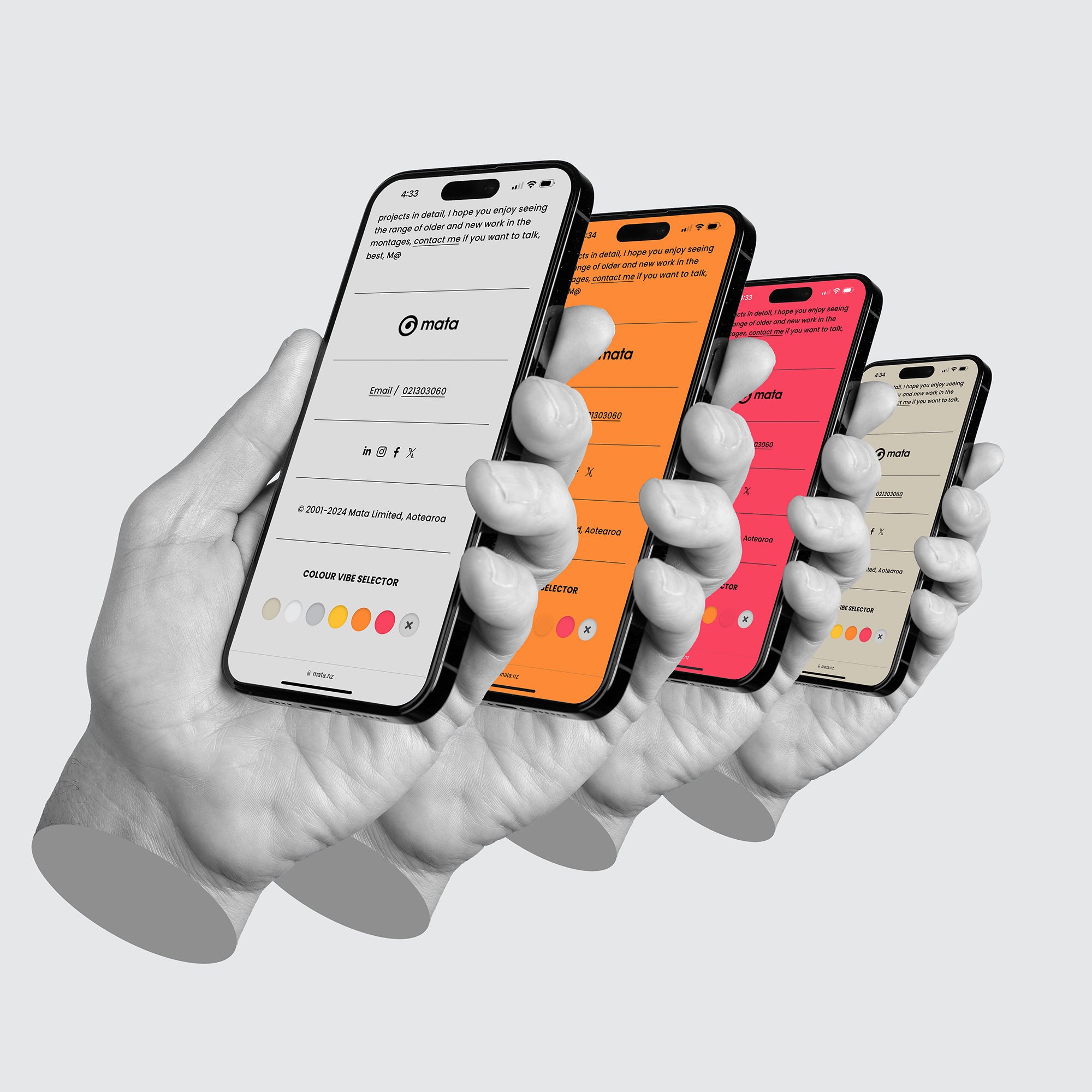
More design projects: