Designing a Seamless DHB Booking Experience
Working on the user experience (UX) pathways and designs for a New Zealand District Health Board (DHB) booking system for Dataprint was fixing problems in patient communicaiton channels.
User experience note
The desktop concept shows a potential privacy option of hiding the appointment type if the user wants to.
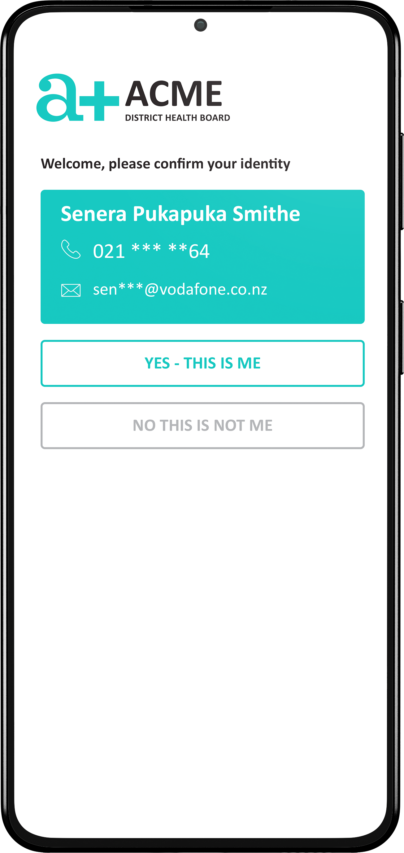
The user pathway from receiving an email with a unique link, confirming, rescheduling or cancelling an appointment.
The goal was to create an instant, seamless, user-friendly solution that worked across both mobile and desktop platforms, ensuring patients could easily schedule, confirm, and manage their appointments.
This project required careful attention to detail and a deep understanding of the patient’s journey from start to finish. I collaborated closely with the team, ensuring every step of the process was smooth, whether it involved booking, rescheduling, or canceling an appointment.
One key aspect was the booking flow. From a patient's perspective, it was crucial to have an intuitive interface where they could select a preferred clinic, time, and location. I developed a responsive interface that made this process as straightforward as possible, even when multiple users were booking the same slots. If no appointments were available, alternative suggestions were provided, ensuring patients always had options.
Moreover, the confirmation process was carefully thought out. Each patient received a confirmation message, complete with the ability to reschedule or cancel through a simple link, making it easier for them to manage their appointments.
Adapting the design to fit the white label requirements of various DHBs opened doors for national use. Each iteration could easily be rebranded, adjusting colors, logos, and text references to align with the specific DHB's branding while maintaining a consistent user experience.
This project was a great example of merging functionality with design to deliver an efficient and visually appealing solution for New Zealand’s healthcare system.


