A new brand voice for Zeald: cutting abstract distractions in social design
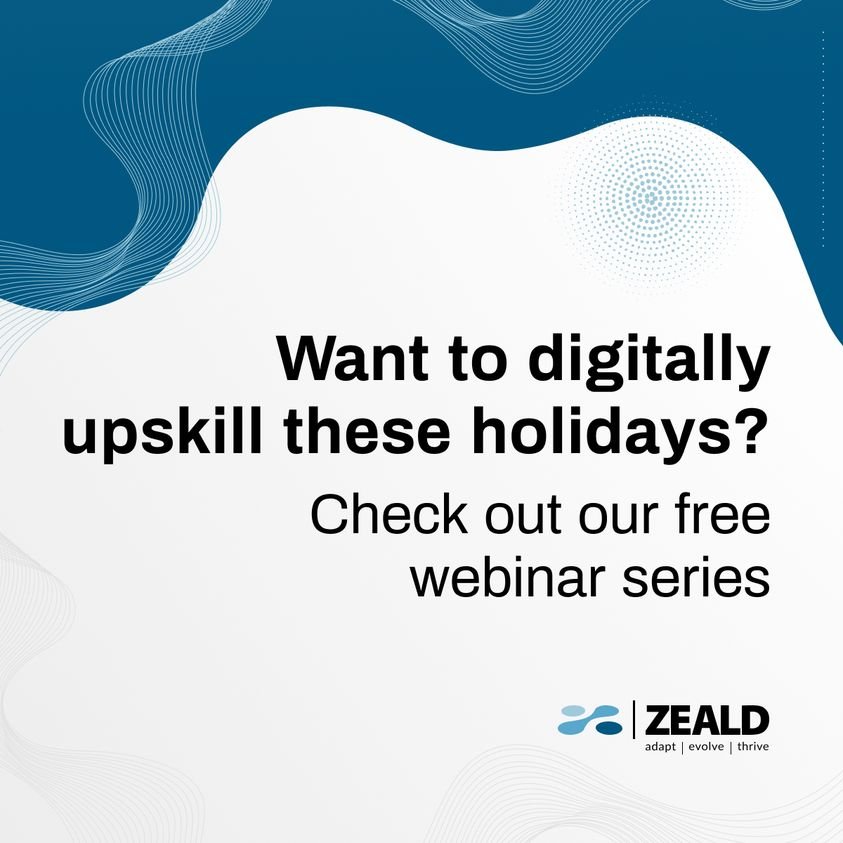
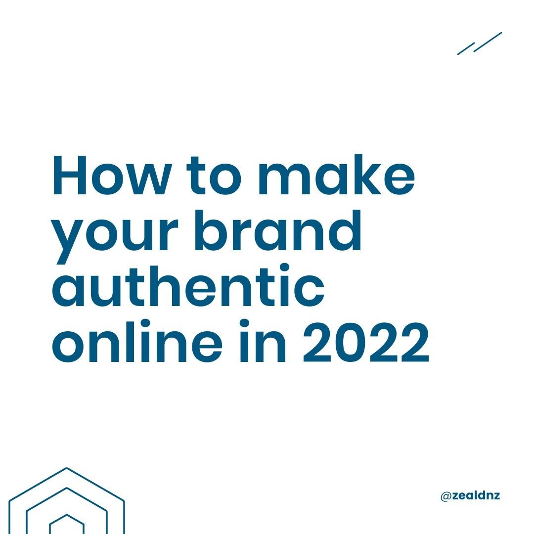
The designs of the social posts were okay but suffered from the use of abstract shapes taking over or interupting the hierarchy and in turn the messaging. These shapes sometimes linked together which was a nice touch but why are they there?
During the design review I saw a plethora of social posts from a huge amount of companies using this style of abstract graphics all over their posts to try and imbure the posts with a tech vibe. The design when silo’d in development might be okay, but not on the feed.
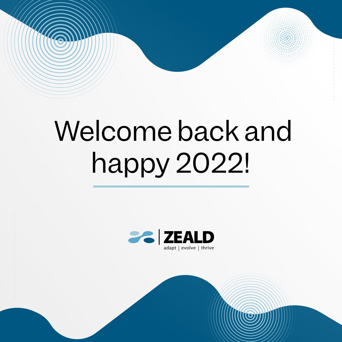
Examples of Zeald’s posts leading into the end of 2022


A new logo, a new voice, one of maturity in the market.
When developing the logo concepts, Hamish came on board to give his ‘mature’ design aesthetic to the team. The mature direction he wanted for the brand was away from bright coloured startup brands and more into the over 20 years of history of the company. Hamish wanted darker dirtier deeper colours to be used in the teal space.
In designing the logo, typography and colour palette all the considerations of the team were taken on board. You can see the announcement post about the logo where the design of the logo and deep teal colours are used. Once the logo design and colour palette were developed that laid the foundation to create some replacement socials.
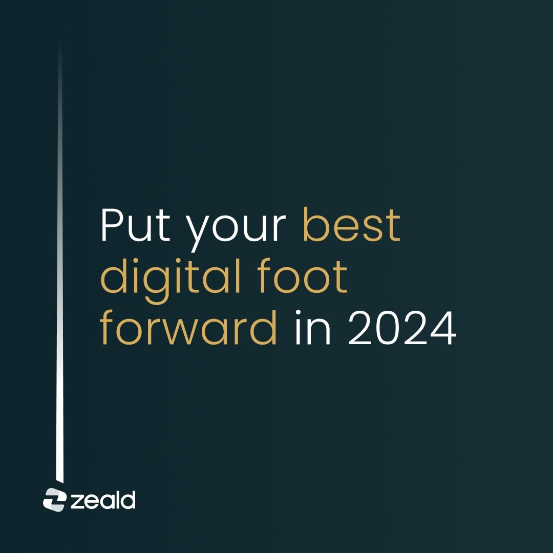
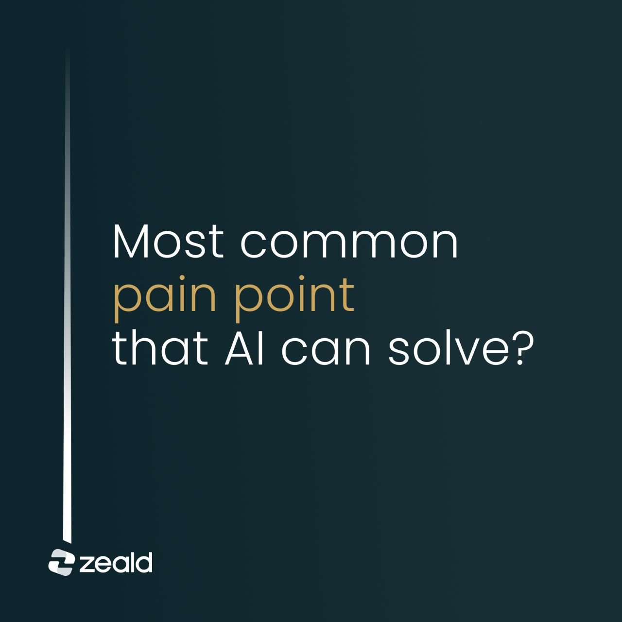
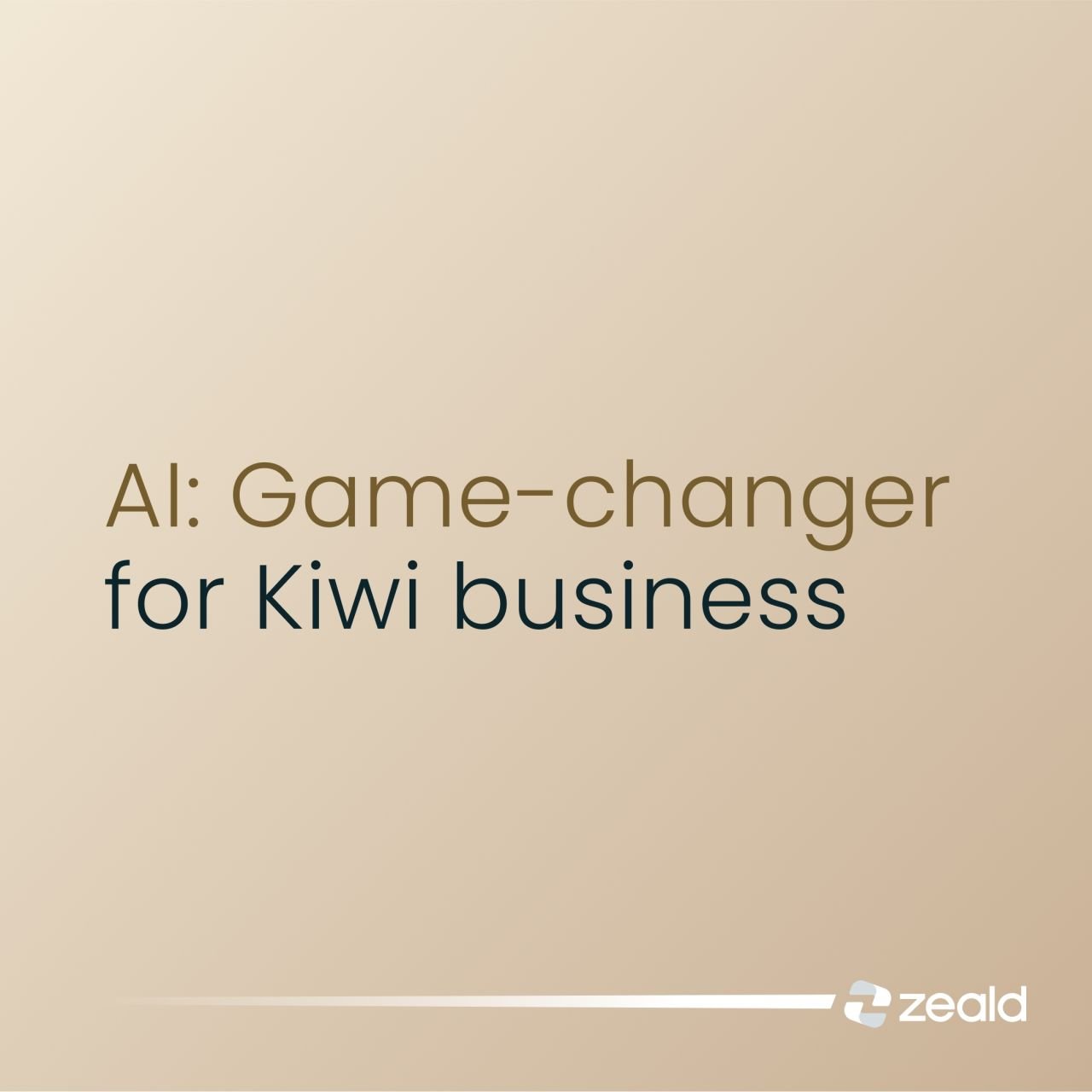
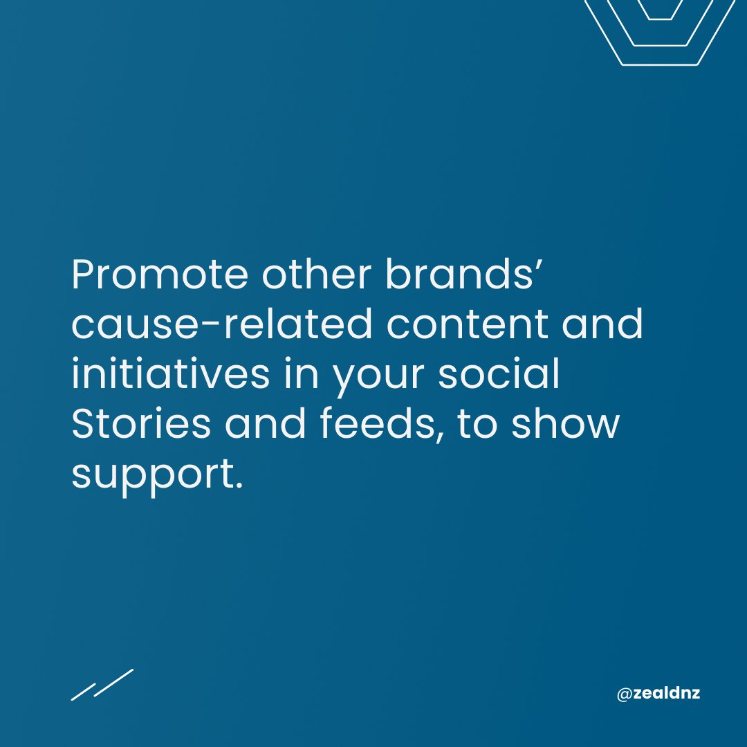
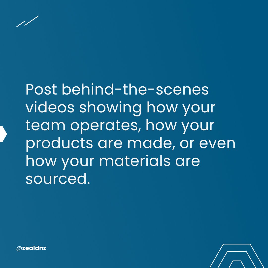
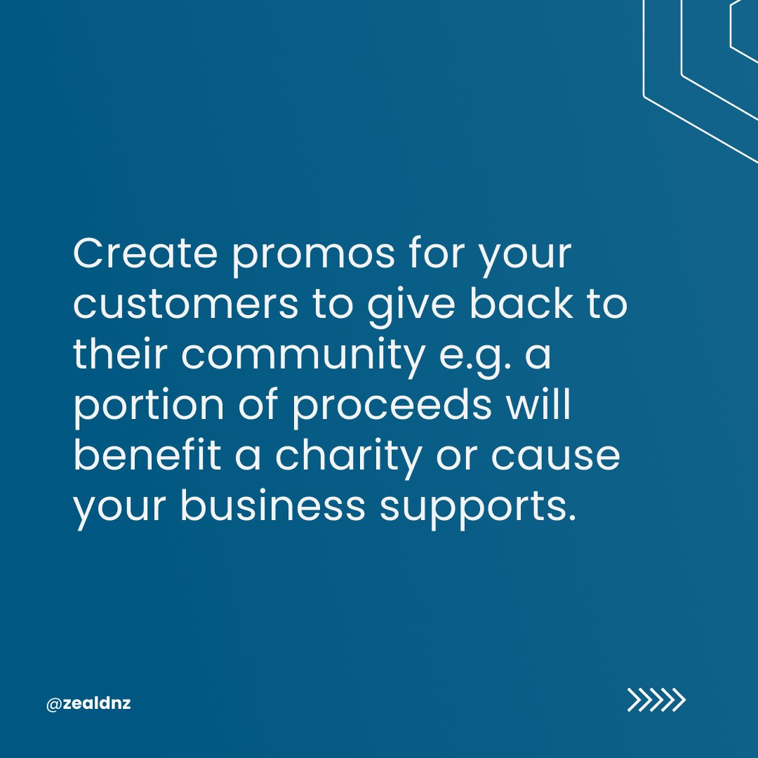
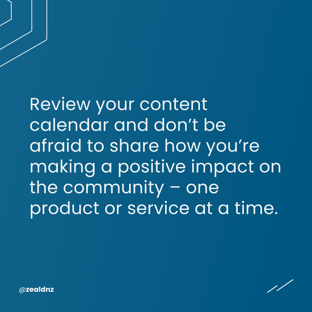
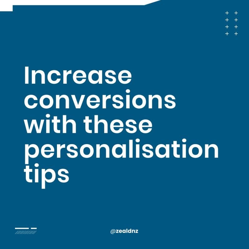
Clarity in messaging - lose the abstract - use the brand.
My solution was to lose the abstract and use emphasis on the important words in each post. A subtle light stream was used to help direct the eye and then flowed into the new Zeald logo. When posting on LInkedIn your logo pressence is controllable on the post graphic but fixed in the ownership layout. Images were created to replicate the content but improve the impact and comprehension of each post.
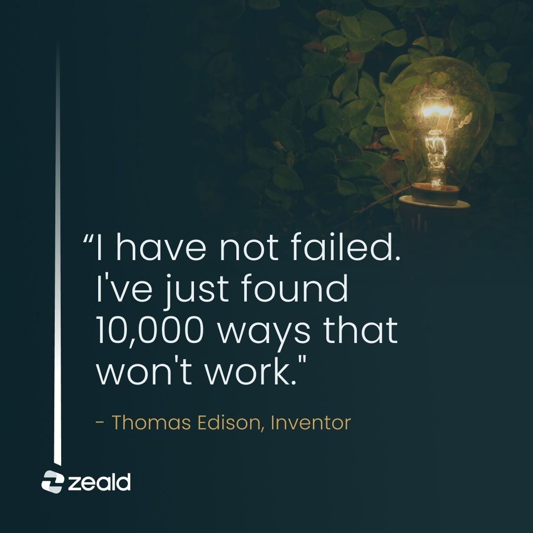
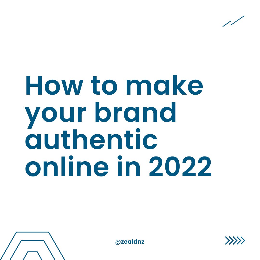
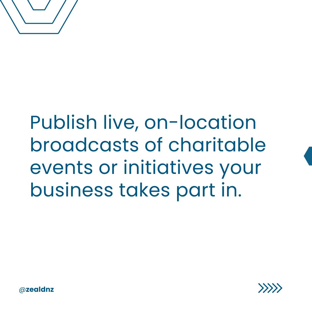
These posts are created by the Zeald design team and follow my art direction guide showing a better connection with the message and brand emphasised. Let’s let the last post sum this up, although it brings in an image, it’s valuable and adds to the post message - always learning, not failing but not working as well, another step closer to achieving that light-bulb moment! A platform to stand out in the sea of the scrolling feed.