Kiwi PyCon XII: Designing a Conference Brand v.2
Kiwi PyCon XII is complete and there was a bunch of new design element uses showcased. The first ‘branded’ conference last year was the first in the new Kiwi PyCon brand evolutions.
Kiwi PyCon XII took the vibrant tech community to Invercargill, offering a fusion of innovation, collaboration, and learning. This annual gathering celebrated all things Python, bringing together enthusiasts, developers, and industry leaders under one roof.

The design and colour palette was drawn from Southland’s picturesque scenery. Attendees were adorned in the pinks and purples of September in Southland. The conference featured insightful talks, interactive workshops, and networking sessions, providing attendees with ample opportunities to expand their knowledge and forge new connections.
Phase one:

The 12 page prospectus goes out. Keeping things easy the prospectus is templated on the grid developed last year. The design remains fairly consistent across the pages as the intended time savings with consistency pay off.

The six Pretix ticket icons are made with the kiwi footprints and other brand patterns. The ticket output system colour branding is tested. Once again keeping things consistent with a colour change being the main difference to keep things efficient.
Phase two:

The poster is designed, there is a full blog post about this. Be sure to read up on how I was inspired by my vintage magazines and new magazines and the work of Europe forming the grid based systems to create harmony between text and image.
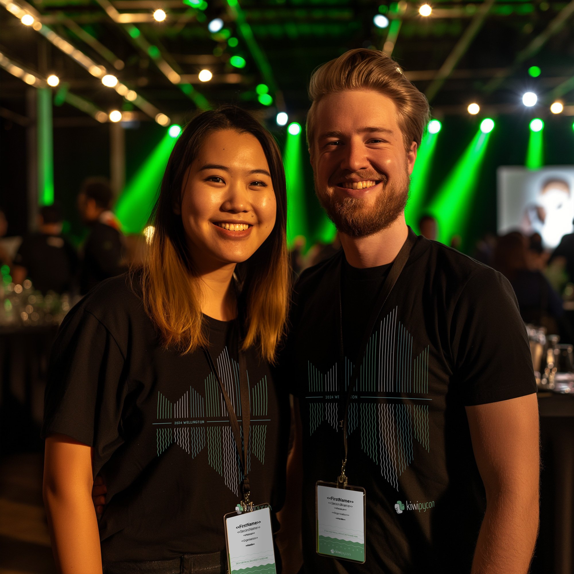
The tee designs are next and depict the brand elements created last year in a local sense.


The design of the tee represented trees, mountains, leaves, rivers and feathers divided by a journey between New Zealand and Japan by the Titi bird. Also people coming from wherever to Invercargill. The custom typography was finished with double lines and the geo location. The Python trails were used in colourways to help represent each design, with the kids tee, COC team tee and the LGBQT tee all sporting different colourways and flourishes. The most playful of which was the kids tee with more obvious nods to nature, tourism and the Southern Cross.


Online elements & integrations:
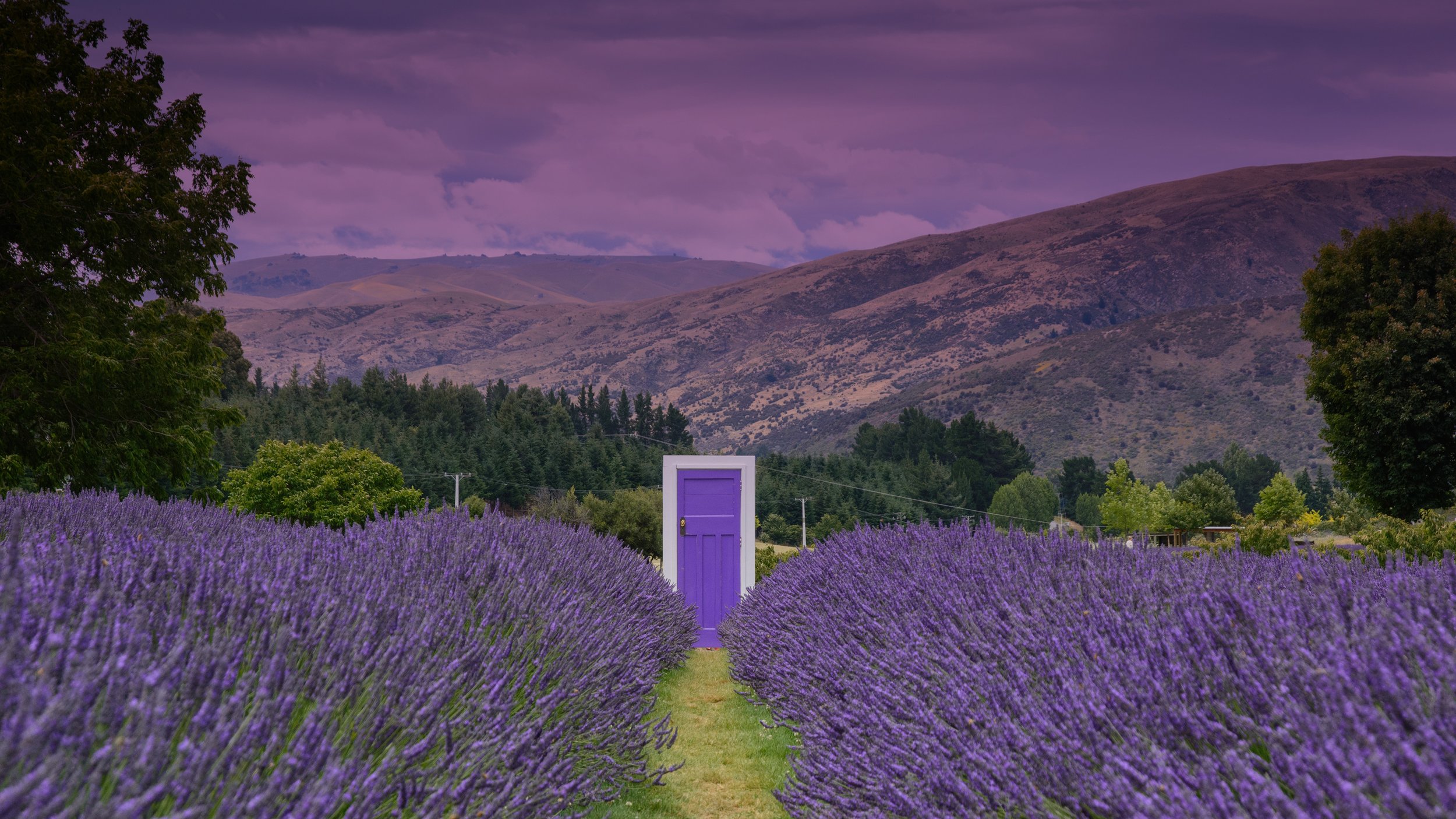
The Lavendar Farm doorway was portrayed as a portal on the journey south ;)
Squarespace Build
The main touchpoint for the conference is Squarespace. The website is updated from last years event with new pages, the older pages are archived and still available as history. The website has graphical requirements like backgrounds, logos, sponsor logo cards and header updates.
Pretix Integration
Pretix is the event ticketing software that has an embedded integration with Squarespace. The conference products like tickets and collateral are loaded up and available for purchase. pretix.eu/
Pretalx Integration
Pretalx handles the conference scheduling. Once again this feeds into the Squarespace website so everything is in one place. Colours, imagery and website formatting art direction is needed here. pretalx.com/
Phase three:


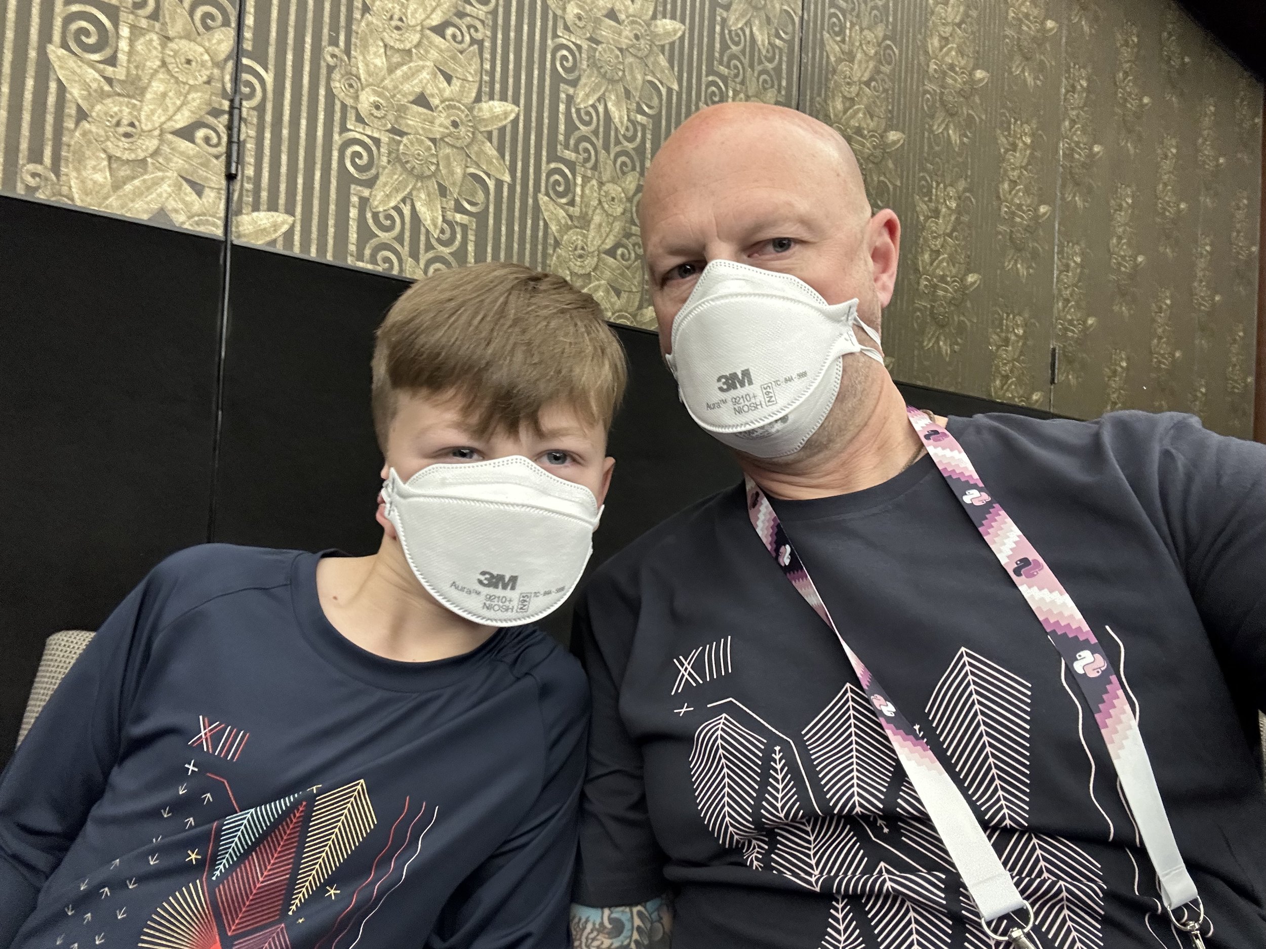
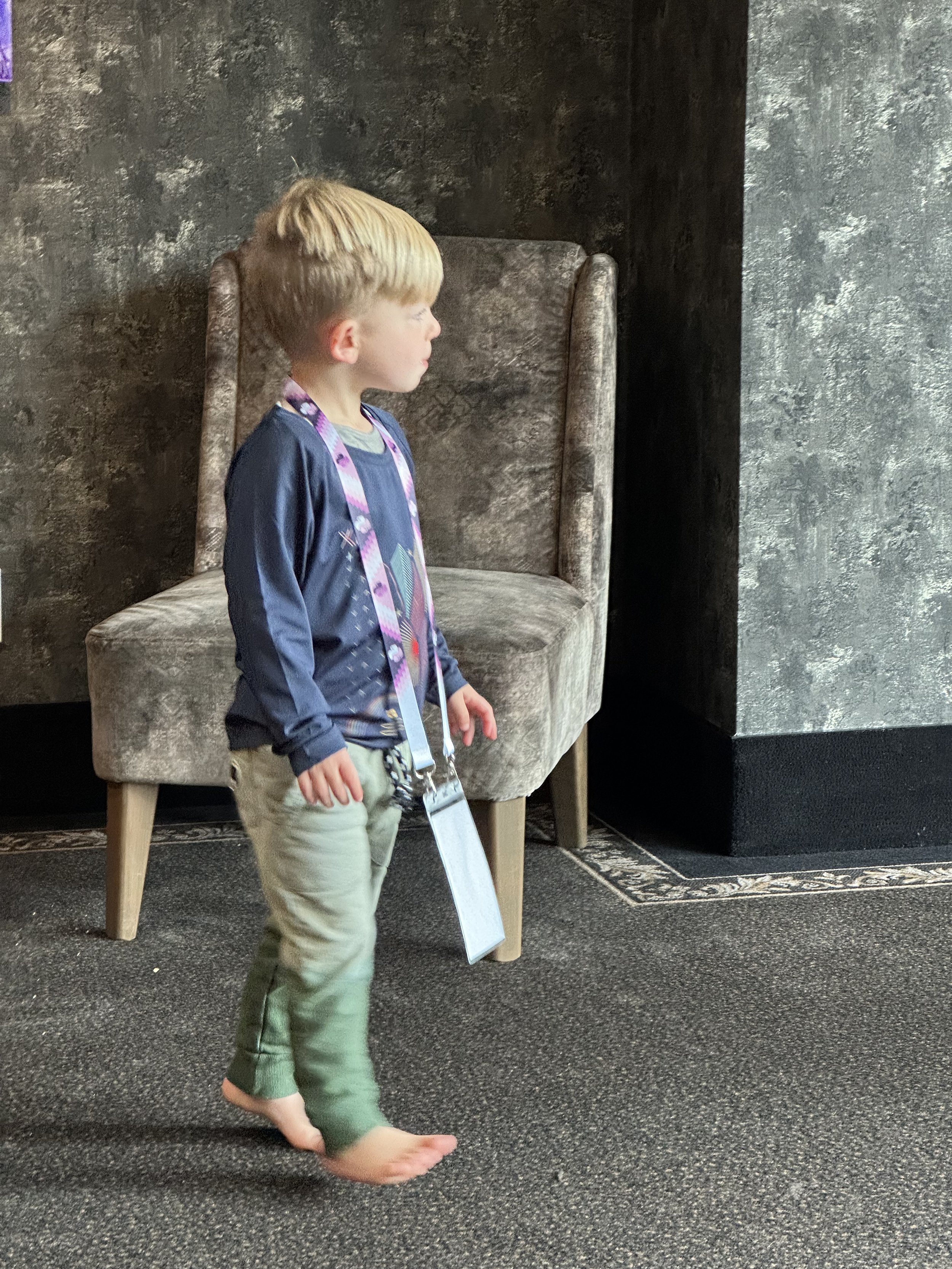
The lanyard uses the same poutama pattern of last year, again creating a brand and reusing things to give the conference an identity that can be recognised. To be allowed to come to the conference was so special, and to see the people who were a part of this gathering I had been a part of for over a decade was incredible.


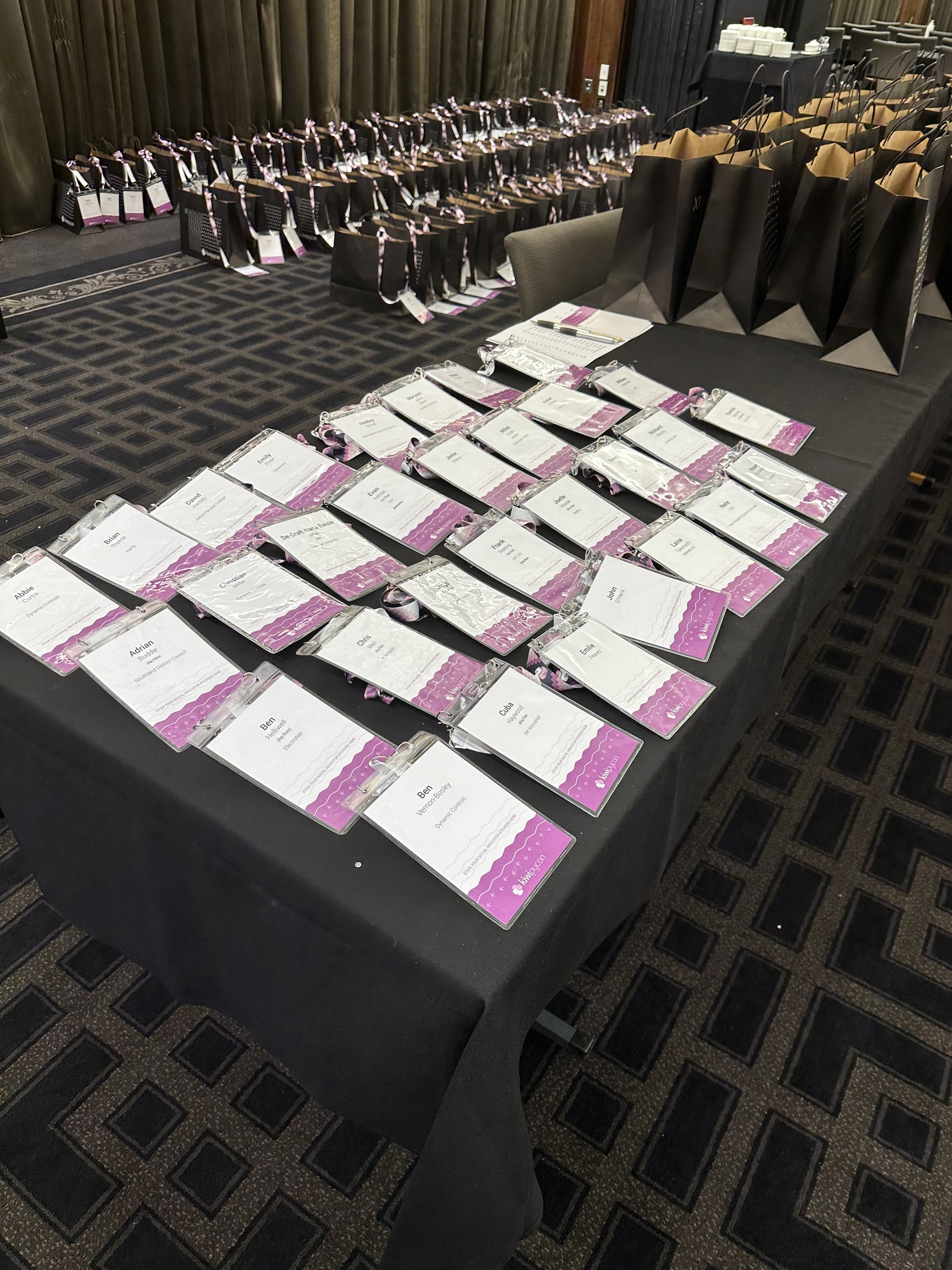
Stickers are created for people to be able to sticker bomb their laptops or books. A lapel pin is also created that can be pinned on to the lanyard ribbon or a shirt. The items are designed to be re-used each year as we learn that lesson of over specification has meant waste.
Phase four:

The prototype slide test with max content.
New for this version of the conference is the keynote slide template I designed. I came up with an overlay system where the type was over the top in Keynote or Powerpoint, the template image behind that and the talk presenters photo is placed in the background and scaled as needed. There was also a variation for two.

The single speaker template with transparency.

The double speaker template with transparency.


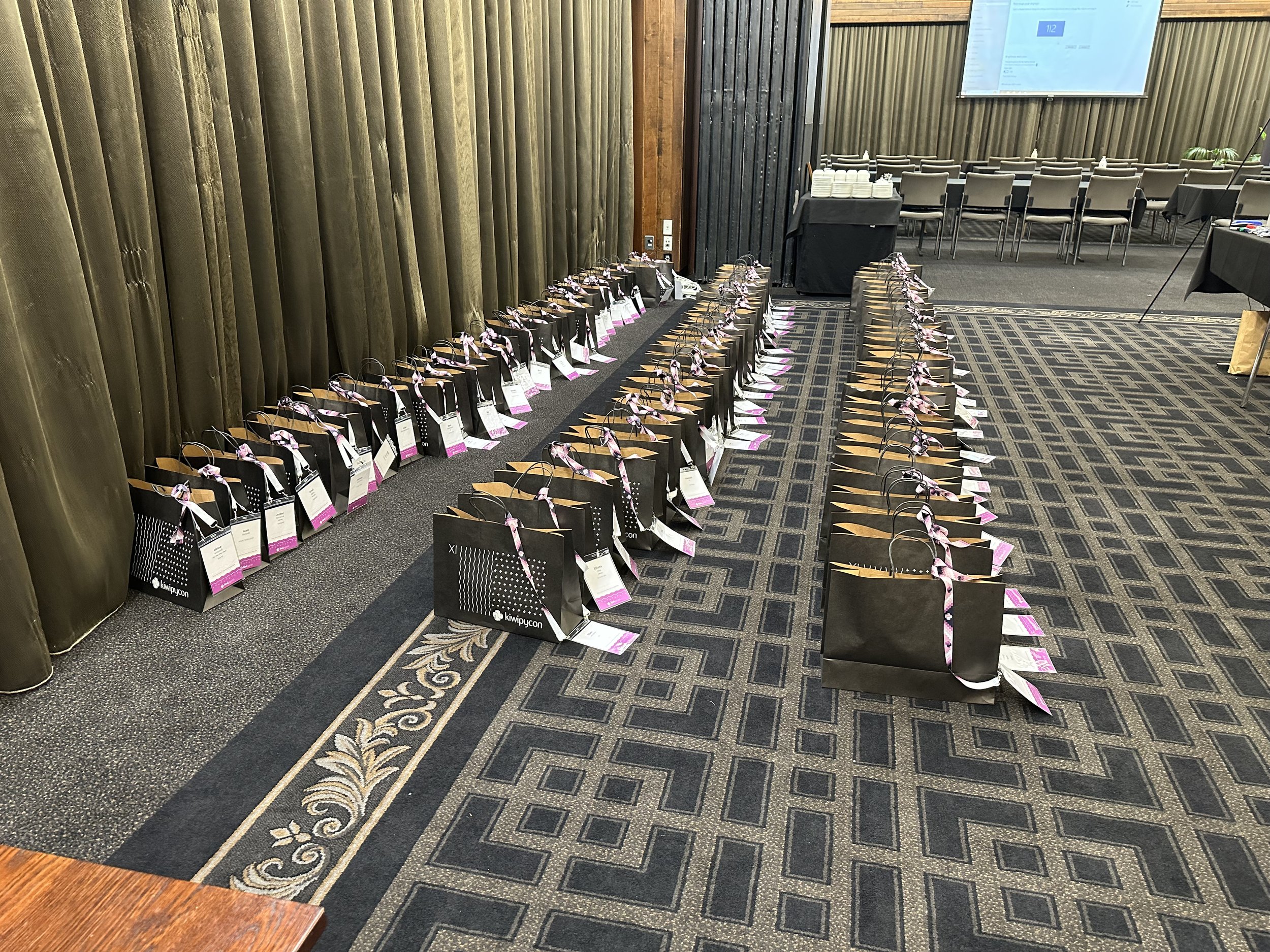
The final items of collateral both physical and digital are coming through now ready for the conference. Seeing the real lapel pin and lanyard ribbon for the first time.
The bag has been redone in the exact same style as last year but with the version of the conference removed now - there were left over bags from Kiwi PyCon XI and they did get used at this event but we all realised that no one can predict the numbers when the lead times are so far ahead of the conference date. Learning as we go still on the rebranding and trying to avoid any waste. A nice addition is a free city guide that’s been branded with the conference to hand out. For this all that was provided was some of the images we were using in the conference brand inspired colourways.
A mall poster is made and placed in the brand new mall on the main street of Invercargill.

Phase five:
The conference is live, we’re all there to see what we can when you’ve got two little ones to manage.
We are Kiwi PyCon
More Kiwi PyCon Projects