Fizz: New poster for a new show.
The brief for this poster design was short, n’ fun.
“The improv show is called FIZZ. It’s being put on by the Mischief Company at Tiny Theatre/Garnet Station in Westmere on August 3, 4 and Aug 10, 11 2023. Tickets are $14 or $10 concession. Need to get the eventfinda info set up. For the image - something really bold, colourful, effervescent. The wording -the Mischief company brings you FIZZ an improvised comedy show”
With this in mind I went into the design with an open mind. Firstly, after designing hundreds of flyers for events over the years, I always love being given open briefs with freedom to create. Secondly this process might be a mystery to some people, so I will dive in to how I like to create event-based promotions.
Designing the FIZZ logo: To start off, there’s nothing to go on, but I look at the word FIZZ; it’s short and can be done in a bold display format. Reviewing a selection of bold fonts, AZO Sans Ultra appealed with its super-bold letterforms and character shaping.


Creating the structure: I place FIZZ on the page as large as possible as it’s a brand awareness and event campaign. The two Z characters make a dynamic lightning style end to the word. There’s also a 50/50 balance going on with FI/ZZ. Using that a 50/50 composition is possible using an angled line that matches the typeface angles. This process was a back-and-forward design process as the poster design was developed.
After the 50/50 composition was decided, more type elements were flowed in and placed on the poster. Type was either on the angle like some of my loved vintage posters I adore or used in clear and informative ways.
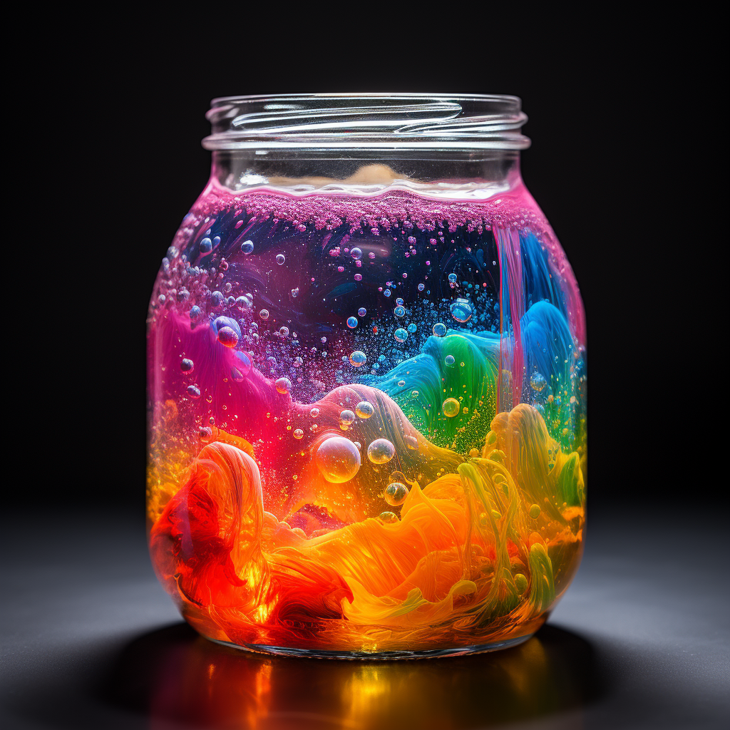
Next I had a look at imagery, and decided to use AI and get Midjourney to create some fun crazy fizzy graphics to go with the 50/50 composition.


Creating the imagery: I use Midjourney and create some fun imagery. I used two prompts to get the images and did many variations on each of those.
For the laughing lady: Laughing female face in rainbow colours made out of bubbles.
For the dynamic bubbles: An abstract bubbling fizzing rainbow coloured explosion.
In conclusion: This was a fun project where I could follow shapes and create something fun, bubbly and colourful. It’s small projects like these that hark back to the fun flyers I really enjoyed doing in the 2000s. Look out for a blog post on them.
Enjoy the AI gallery below.