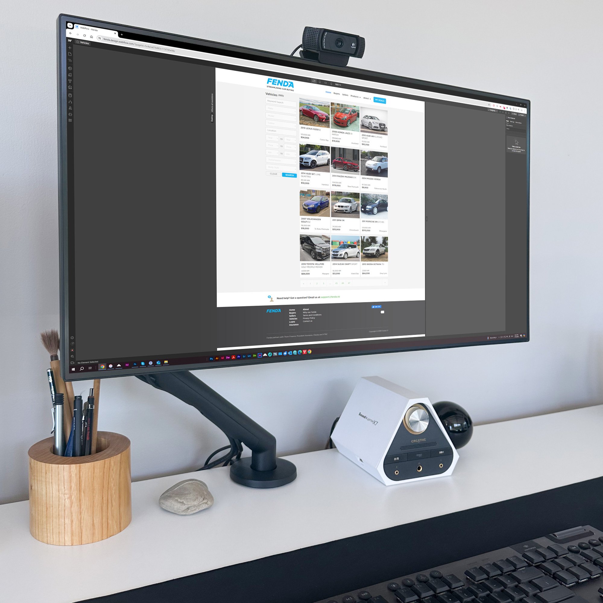
Fenda: A product design from concept to delivery built in Webflow.
Fenda, conceived by Jeff Knight, emerged as an extension of the Checka registration checking service.
It aims to streamline car transactions entirely online, offering a superior alternative for buyers and sellers. Checka Limited, operational since 2009, offers online vehicle checks and related solutions to consumers, financial institutions, dealers, and businesses associated with motor vehicles. “We provide innovative website and software solutions to safeguard customers during used vehicle transactions.”

The New Zealand second hand car market is one with high risks and little to no support for buyers and sellers.

Jeff Knight
VP – Global Sales & Digital First Solutions @ Solution Dynamics
“Matt Allen has supported my various tech ventures over the past 15 years. Matt has been my go-to for product design services - he’s fused brand strategy, design, website, and product design to get the best results. His attention to the detail that matters and thinking outside of the box coupled with a unique creative design capability really sets him apart from the rest. He is good to work with and gets cut-through quickly. He would be an asset to any business and I cannot recommend him highly enough.
The Brief
“Our mission is simple - we want to create a better way for private buyers and sellers of motor vehicles to strike a deal on their own.”
At Fenda, we believe that the second-hand motor vehicle industry needs reinvention. The core of how people typically buy vehicles has not changed since the 80’s and whilst internet-based advertising has created some wins for the private seller/buyer, buying privately is harder and contains more risks than going through a licensed motor vehicle dealer. Dealers (at least some) will manage the buyer’s risks and critically arrange for finance and associated insurance products.
Fenda’s objective is to fix the problem by providing world class technology and financial services products so buyers can buy motor vehicles privately but with confidence and strike a deal that is both good for the buyer and the seller.
Kicking off the project with branding
In discussions with Jeff, I proposed a typographic logo (wordmark) where the name was the logo to help get the brand done with little-to-no fuss, and get stuck into the product design.
The first step, the simple brand proposal - a functional, friendly wordmark and instantly identifiable.
Typography
In the typography review process the typeface Gotham Black Italic stood out as a really good candidate, Gotham worked well with the word at every weight. Other fonts had merit too, so next step was customisation to make it look like the other good candidates Marquee, Asap and Neotech.
Letterform Customisation
The other candidates had soft edges or curves - so to make the Gotham font softer corner radius values were added to the type elements - 1.0 mm for interior and 0.5 mm for exterior. What this does is soften the word and make the brand friendly. The combination of curves gives a crispness combined with softness giving the letters a vibrant composition.
Design & Illustration
The D and the A don’t play that nice. So, filling that gap was a solution using a range of swish air effects. Fender research was done, then penny dropped this makes the D be the fender with air coming from the A. I illustrated various options for review and the simple single one worked. Pure cyan, sky-blue inspired, 100% CMYK colour was chosen to be the brand colour.
Scoping out the project scope with website and user pathway interfacing schematics
The marketing structure is created and shows the funnels for users will be offered. From here the users interface pathways are laid out in schematic form.
As Fenda is a communication platform the user pathways often end in submissions of offers, counter offers and successful sales, listings and offers.
This simple way of looking at the system of the product allows the developers and me the full-stack designer to see the scope of the product functions and integrations.

Wireframing the desktop user experience
Wireframing the desktop experience took place from November to February and the document went through 14 itterations by then.
Alongside the desktop wireframing the mobile wireframing, conceptual user pathways were being developed in tandem to push the content forward to the main website offer. The main areas of desktop were created with responsive needs in mind and paramount for the negotiation process.
Looking at the wireframes is the home page, buyers, sellers, finance and insurance, negotiations, vehicle listings and detail page.
The process is itterative and rationale and feedback documented for records.

Wireframing the mobile user experience
Wireframing and pathways for the mobile view was completed and parked at the marketing stage as a simple demonstration of the layout changes was enough to show responsive breakpoints and results.
Where the real work went was into the negotiation and application processes for the DealStrike process. The mobile wireframing goes through 10 itterations and takes place over two weeks from late October to early November.
One major user experience push was to get the processes in easy to steps - looking at a 2-3 page application process can be daunting and the idea with the mobile user experience design was to cut out anything that was not needed and serve up simple step by step views.
The wireframes use colours to show pathway status and link to user experience touchpoints. UI elements are designed to work for touch and be easy to use.

How are we going to build this?
Everything is ready-to-go in terms of getting the product build underway.
I build this by hand-coding the front end from scratch with responsive HTML, CSS and JavaScript?
Or, build with the CSS core-driven website build platform Webflow.
A few meetings later with Jeff and the developers at Endev and we’re using Webflow.
Building the DealStrike system in Webflow
Through the wireframing and user pathways development discussions were had with the development team about how to approach the front end build and back end integration.
We started with the heavy lifting dev area of the DealStrike system that had the offer, negotiation, sale, finance and insurance processes to build.
Using Webflow I got straight into design and front end build of the interface elements, interactions, forms and responsive behaviour of the pages.
As the development team are building the back end, front end elements get created to go along with the build. The developer first build process is going well with the export of the HTML, CSS and Scripts working well. Each iteration can be exported with the classes and build being updated if needed - working together developers and front end for fast build updates and changes.


Webflow interactions are added to elements. Button animations, load animations, hover states and selected states for buttons, form elements and images are implemented.
The DealStrike process is being mapped out and developed - questions pop up about functionality and pathways for each user type. Mobile view designs are done for dev pages.
Pathways are developed to thouroughly document the user journeys and development requirements. Wireframing the solution was quick and a good way to see the global implications of user choices.
Front-end delivery of the entire Fenda offering
Once the DealStrike system was harmoneously flowing through development, it was time to do the rest of the front-end build. Mockup pages were created with each having a responsive version for tablet and mobile. For the car listing side of things - another big chunk of the project - CSS grid was the option for the layout.
At the time of Webflow’s build releases CSS Grid was fairly new. And one thing that was a real issue for the developers taking on the front-end builds was Webflow’s handling of CSS Grid.
Like Squarespace - wisiwig creator Webflow relies on ID calls - ID calls need to be unique so Webflow was applying long spurious IDs to every grid location. Nice when you don’t have to touch it, imagine a 9 x 9 grid you just set up, and having to create 81 IDs for the grid compartments? Well, that would be a pain right?


So they automatically gave them long spurious IDs - for a standard user it happens in the background seemlessly. Hand it over the developers and it’s like giving somebody a random bucket of stuff.
Webflow could have fixed that at the time by giving you a prompt to give your grid a unique ID name and then co-ordinates as IDs. Something that would be readable and replicatable rather than unique random strings. A bump in the road of the front-end to developer path, but they worked around that okay.
When you’re given so much by a system there’s bound to be some pain points - that can be said of every SAAS style website builder.
The mockup marketing pages are done to a level ready to hand off for developers to complete the website and make it live. I did some art direction through this process.
Remote Art Direction: Enhancing User Experience with Subtle Tweaks
In the realm of web design and user interface development, remote art direction has become increasingly important. It's about ensuring the visual and interactive elements of a website are cohesive, engaging, and intuitive, even when the team is spread across various locations. Here are some insights and tweaks we worked on to enhance the user experience.
By addressing these issues and implementing the proposed solutions, we aimed to create a more polished and user-friendly interface. Each tweak, whether it's a color adjustment, animation fix, or data emphasis, contributes to a more engaging and intuitive user experience. Remote art direction might come with its challenges, but with clear visual communication and attention to detail, we can achieve a cohesive and effective design.

Remote art direction using screenshorts and descriptive rationale.
1. Navigation selection
Current Issue: The blue color of the "Home" button can remain the same as the active state.
Proposed Solution: I'll explore options to set this color scheme in Webflow to ensure a consistent and visually appealing navigation experience.
2. Phone icon animation
Current Issue: The phone icon is supposed to jiggle when hovered over, but this interaction isn't functioning correctly.
Proposed Solution: Investigate and troubleshoot the hover interaction to ensure the phone icon jiggling effect works seamlessly. This adds a playful and interactive element to the user interface.
3. Icons interaction animations
Current Issue: Icon interaction animations are not working properly.
Proposed Solution: Review and fix the animation issues to ensure all icons have smooth and engaging interactions. These small animations can significantly enhance the user experience by making the interface feel more dynamic and responsive.
4. Registration or VIN entry
Current Issue: The input for registration or VIN should be in uppercase only.
Proposed Solution: Modify the input settings to automatically convert all characters to uppercase, ensuring consistency and readability for users.
5. Car model, year & variety emphasis
Current Issue: There is insufficient emphasis on specific car details, such as the R32 part of my car's description. This led to a broader consideration of how various car varieties and names are displayed.
Proposed Solution: Highlight key details like "R32" more prominently. Additionally, consider how other car models, like the Audi A4, display their variations (e.g., 1.8, 2.0T, Quattro). While we are constrained by the data collected, more emphasis and additional data would enhance user satisfaction.
6. Audi A4 descriptors
Current Issue: Concern about how the Audi A4's specifications are displayed. For example, whether it shows "2.0T" and "Quattro" accurately.
Proposed Solution: Clarify that the Audi A4, like the Golf, will display "2.0T" for turbo and "Quattro" for 4WD. For other cars with similar features, ensure these descriptors are consistently shown. If a car is described as "Quattro," we can consider removing redundant 4WD checkboxes to avoid confusion.
Fenda launch items to make real-world impact
Seeing Fenda with your own eyes needed a real brand impact. Fenda neede teardrop banners, polo shirts, and car signage to maximize brand visibility and create a cohesive marketing strategy. Teardrop banners are highly effective for outdoor advertising, attracting attention with their dynamic shape and movement. They are perfect for events, sales, or promotions, instantly catching the eye of passersby. Polo shirts branded with the Fenda logo serve as mobile advertisements, enhancing brand recognition wherever employees go. They also foster a professional and unified team image, crucial for customer trust and engagement.
Car signage transforms vehicles into moving billboards, ensuring continuous exposure to a broad audience as the cars travel through various neighborhoods and business districts. This method of advertising is cost-effective and versatile, capable of reaching potential customers during daily commutes and errands. By combining these three marketing tools, Fenda can create a powerful, multi-faceted promotional campaign that significantly boosts brand awareness and drives business growth.

Further user needs to be given the user experience treatment
Implementing a step-by-step mobile-first loan rate estimator for Fenda offers numerous advantages, particularly aligning with the previous DealStrike development, enhancing user experience, and driving customer engagement.
Enhanced User Experience: A mobile-first design ensures that the loan rate estimator is easily accessible and user-friendly on smartphones and tablets, which are the primary devices used by most customers. A step-by-step approach simplifies the complex process of loan estimation, guiding users through each stage with clear instructions and intuitive navigation.
Increased Accessibility: By prioritizing mobile users, Fenda can reach a broader audience, including those who rely solely on their mobile devices for financial planning and decision-making. This accessibility is crucial in today's fast-paced environment, where convenience and speed are paramount.
Consistency with DealStrike: Aligning the loan rate estimator with the DealStrike development ensures a seamless and cohesive user experience across Fenda's digital platforms. This consistency reinforces brand identity and trust, making it easier for customers to navigate between services without a learning curve.
Personalized User Journey: The step-by-step format allows for personalized interactions, where users input specific data about their financial situation and loan requirements. This tailored approach can provide more accurate and relevant loan rate estimates, enhancing user satisfaction and trust in Fenda's services.
Higher Conversion Rates: Simplifying the loan estimation process can reduce user drop-off rates. Clear, incremental steps keep users engaged and less overwhelmed, leading to higher completion rates and, consequently, higher conversion rates from potential leads to actual customers.

Data Collection and Insights: A step-by-step loan rate estimator can collect valuable user data at each stage of the process. This data can be analyzed to gain insights into customer preferences, behavior, and needs, allowing Fenda to refine their offerings and marketing strategies effectively.
Competitive Advantage: Offering a mobile-first, user-friendly loan rate estimator sets Fenda apart from competitors who may not have as streamlined or accessible tools. This technological edge can attract tech-savvy customers looking for efficient financial solutions.
Scalability and Updates: A mobile-first design is more adaptable to updates and new features. As Fenda's services evolve, the loan rate estimator can be easily scaled and enhanced to meet changing customer demands and technological advancements.
Promotional social and website marketing collateral
Public launch is here, so digital marketing examples are created for sharing on social networks.


This project ends November 2020 - and we’re in the grips of Covid - gah! Another huge idea paused due to the pandemic.
More website design and build projects


