The Cloud House Logo: Dancing around Cliché’s during Design and Discovery
Designing a logo is a delicate dance of creativity, precision, and understanding.
When Scott Judson, a former colleague from Terabyte Interactive, approached me to create the brand identity for Cloud House, I knew it was an opportunity to create something truly unique.
As a boutique cloud integration technology company, Cloud House wanted a logo that resonated with its ethos of being "future cool," simple, design-led and not cliché.
This post details the journey we took to develop a logo that embodies these values, guided by the insights provided by a rationale based brand proposal.

Scott Judson
Founder of Cloud.House and current Senior Technical Account Executive, Digital Natives at Microsoft
“Keep it up Matthew, the work you did in branding Cloud House was outstanding!”
The Design Process
Understanding Cloud House
The first step in our process was to immerse ourselves in the world of Cloud House. Scott provided a comprehensive brief that outlined the company's vision, mission, and target audience. Cloud House aims to be a trailblazer in the cloud services sector, focusing on simplicity and elegance in both design and functionality. This understanding was crucial in shaping the direction of the logo.
Inspiration and Visual Reference
We gathered a diverse range of visual references, from cloud iconography to geometric shapes and modern design elements. This stage was about exploring possibilities and identifying common themes that aligned with Cloud House's brand identity. We wanted the logo to reflect the company's innovative spirit and design-led approach, avoiding the clichéd enterprise look.
Exploring Shapes and Elements
From the visual research, I delved into basic shapes, experimenting with isometric cubes and geometric patterns. The idea was to create a logo that subtly hinted at a house and cloud motif, without being overtly literal. The use of cubes represented the structured yet flexible nature of cloud computing, while the house element symbolized stability and a welcoming atmosphere.
The first 12 pages of the brand proposal go through the briefing and research phases.
The Design Concepts
Geometric Networked House Cloud
Another concept explored was a geometric network pattern, representing connectivity and the cloud's ubiquitous nature. However, this design faced challenges in terms of balance and clarity, often appearing too abstract. While it captured the idea of networking, it lacked the clean and straightforward aesthetic we aimed for.
Isometric Cube with Layers and House Motif
One of the primary concepts that emerged was the isometric cube. This design featured layered cubes that formed the silhouette of a house, subtly incorporating the idea of clouds through stacked layers. The transparency and layering effect aimed to convey a sense of depth and complexity, mirroring the multi-faceted nature of cloud technology. The colors chosen ranged from bright, sky-like hues to more muted tones, offering versatility in the logo's application.
Feedback and Iteration
Throughout the design process, I maintained an open dialogue with Scott and the Cloud House team. Feedback was invaluable in refining the concepts, particularly in addressing concerns about the balance and readability of the logo. The initial isometric cube design, though well-received, underwent several iterations to reduce the dominance of the house structure and enhance the cloud-like appeal.
Initial concepts for the logo design in order of preference, further concepts and then proof of concept through faux implementations.
Refining the Logo
Finalizing the Design
In the end, the decision was made to go with a refined version of the isometric cube design. The final logo features a lighter, more streamlined version of the cubes, with subtle curves and carefully adjusted kerning in the typography. The use of lowercase letters and the inclusion of a period helped maintain the URL-like appearance, emphasizing Cloud House's tech-savvy nature.
Conclusion
Designing the Cloud House logo was a collaborative journey that balanced creativity with strategic thinking. The final logo is not just a visual mark; it's a representation of Cloud House's commitment to simplicity, innovation, and excellence. As a designer, this project was a rewarding experience, allowing me to delve deep into the essence of a brand and craft a logo that truly resonates with its values.
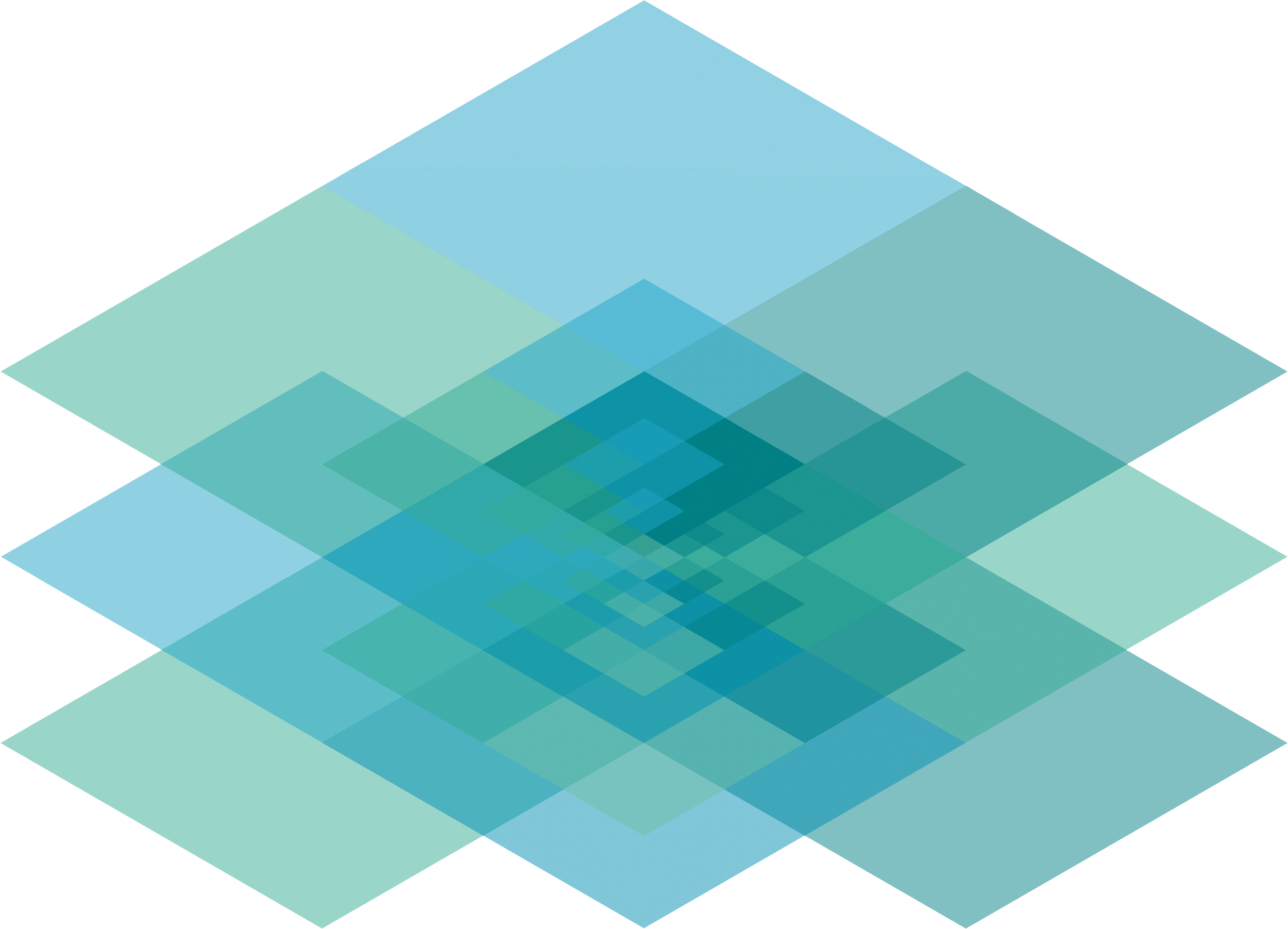
The Cloud House pattern showing nanometer style scaling of cloud computing power via integration.
More branding projects: