Art A Face: Brand is all about face
Having a chance to refine the Art A Face brand was a great project. Part of the sideline projects was developing a brand suite of collateral for the Art A Face brand.
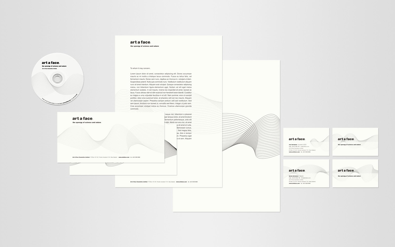
Being a boutique skin care and rejuvination product, a high quality and minimal design was used throughout the packaging which then flowed on to the stationery collateral.
The collateral used the Art A Face Helix, a new design developed in the start of the redesign process. The helix was a smooth flowing brand motif that was used across the brand and then used to link up the products in a nice way for cross-product promotions.
A simple minimal black and white approach was used for the stationery collateral. The overall brand shift being a complete turn around, an ‘about face’ flip, from more traditional styles to a modern and thoughtful design solution.
The helix design was printed at 100% black on the back of the letterhead to show through to the other side on both the letterhead and the compliments slip. Seeing as both were used for short communications that was an nice to touch of technique of bringing the helix into the designs.