Mobile video editing for iPad: For Antennahead
What a great project :) designing an iPad video editing interface for Deane Nathan of Antennahead with a focus on social hot spot creation for video content.
The objective was to create an engaging, intuitive interface that seamlessly integrates video content within the tech of Antennahead's platform.
The design process focussed on clarity and accessibility, ensuring that users could easily navigate and interact with video features like hotspot creation and social engagement. I aimed to create a connection between the interface and the content. A touch focussed user experience that maintained a dark rich tactile aesthetic.
Walkthrough of user pathway for a new user to editing a video through a touch interface.
App launch screen with branding.
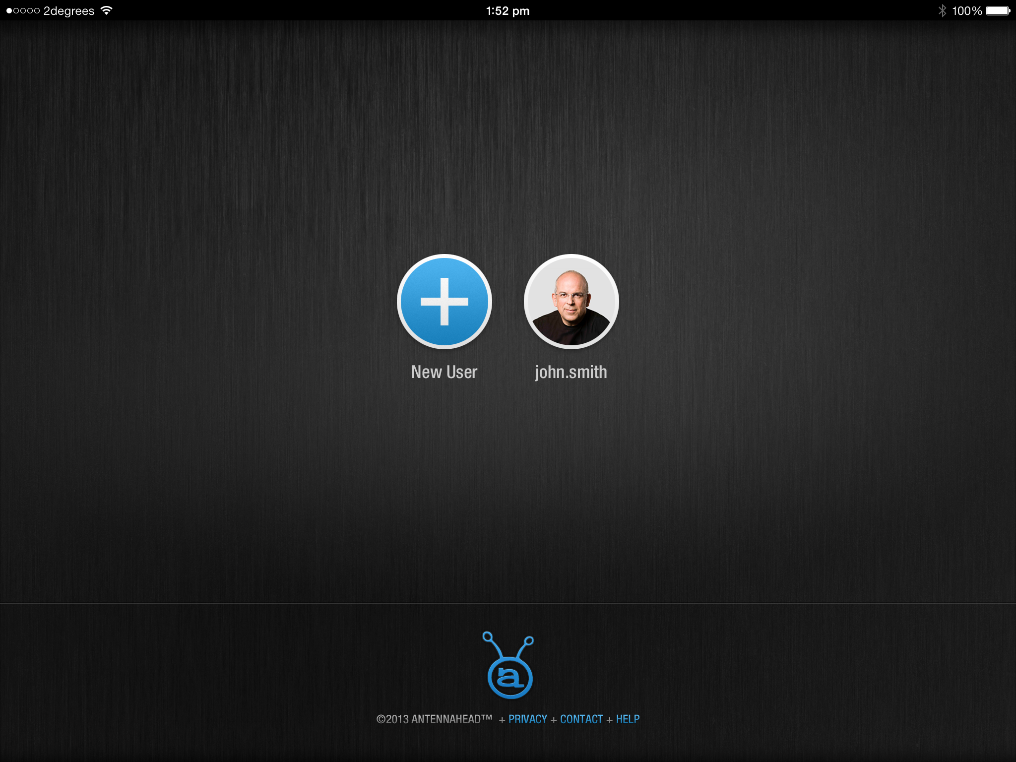
New user screen. With nobody signed in on the device the only pathway is to create an account.
Account can be either through a social connected account or email account with Antennahead.
Signing up for a new account with wrapping right-side labels on the form - a personal idea to keep the label visible at all times while putting it in a weaker comprehension position for UX improvement.
Account selection and creation.
Password entry for a user login with auto login.
Empty drafts.
Full library video feed.
Creating a new clip.
Adding content to a clip.
Draft video clips. Adding in new recorded content or existing camera roll content for the editing.
Interactive clip dashboard showing touchpoints and engagement analytics.
Hot spot list detail navigation.
Accordion reveal of hotspot data.
The editing interface.
Naming the video.
Scrubbing the video.
Adding an interactive hotspot.


Looking back, coming forward.
With a project like this, it’s nice to look back at the rich skeumorphic designs, old social branding and overall feel. The design was supposed to replicate a studio setup, with brushed steel and physcial buttons to emulate hardware. Modern versions of this are now happening in the browser, with some great experimental physical user interface elements being made.

