Kiwi PyCon X: 10 Years of Kiwi PyCon celebrated with design.
X Marks the Spot
Yep, this was a huge fresh idea with one of the recap episodes on the inside - you know how they hooked you in with a little bit of new content and then showed re-runs as memories. That’s what this was, a celebration and homage to the years gone past.
First let’s look how the design journey took place in pictures:
The idea for the 10th version to be the Roman Numeral X was a given for this conference. With that and the challenge to celebrate the decade (and more) of conferences - well, it’s pretty special for sure.
The design started off with a nice bold typographic X - from there testing designs were made to the get concept across to the team.
Combining so many different styles was a challenge with different content, 3D angles, curves and gridded items. Joining them all together was a joyful puzzle. Playing with designs you have made over a decade is a load of fun, and one of the projects you relish the chance to have.
Looking at the keyline structures of the tee designs, woah!
The nine designs of previous Kiwi PyCons - all of them designed by Mata except one - the chef in position four.
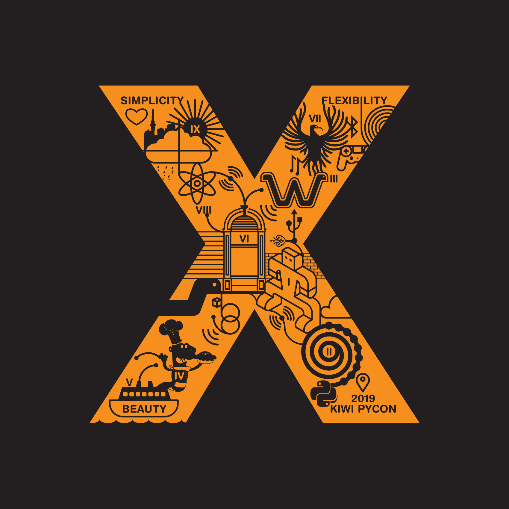
The design for the conference was a mashup of all the previous designs. Can you spot the elements in the slideshow animation from each year?
The overall design for the Kiwi PyCon X was a minimalist maximalist object - simple in one way and the deep dive into years of conferences in another.
Kiwi PyCon X Tee Design
The t-shirt design was a direct transfer to from the concept above. That gave the shirt a popping orange colour and overall the dominating X and inner art shone through to make something dynamic.
There’s more to come on this story, documenting a favourite colour combination of mine, black and orange. For now:
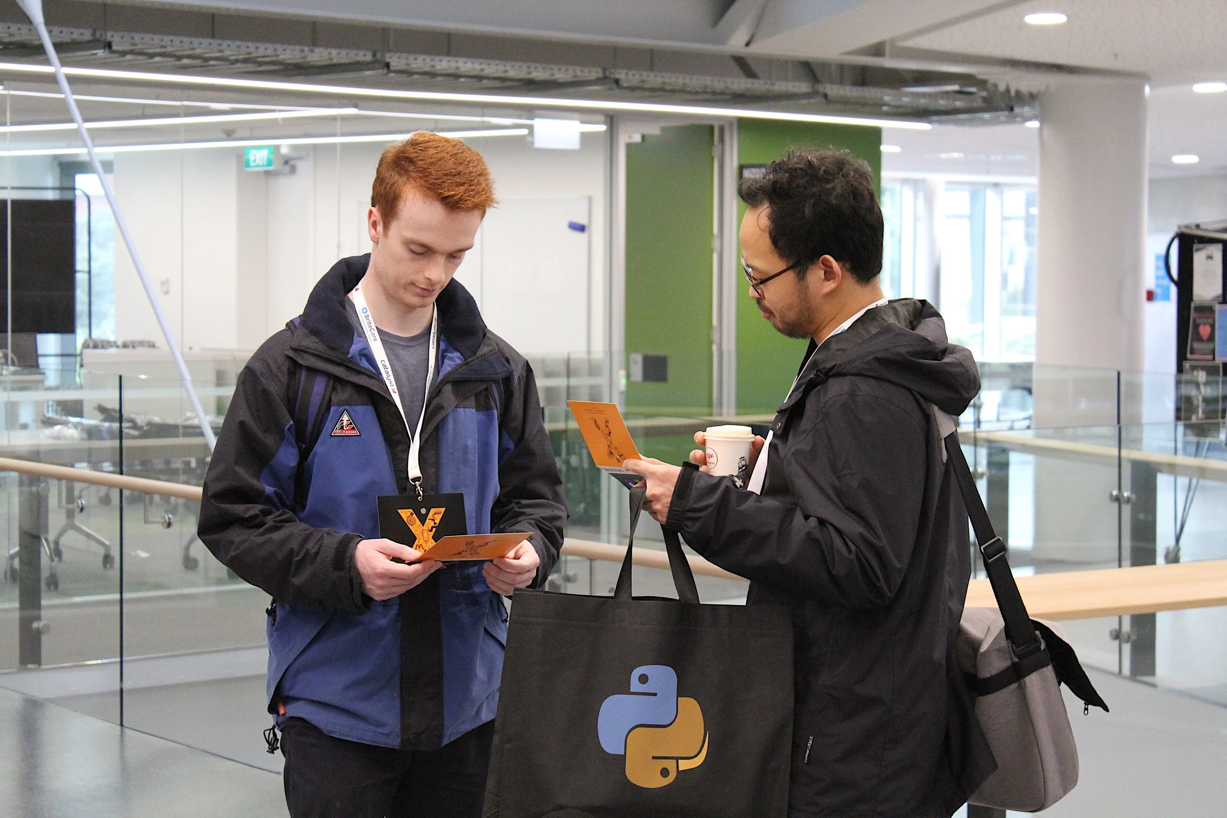
Scenes from Kiwi PyCon X - always great to see your work in the wild!


