Scary: Damning findings applying for remote work opportunities / beware 🤑
Local Work
I have been sharing that it’s been quite quietly quiet on the work front lately - thankfully, things have picked up, but I still do need some more solid long-run projects come in. So I have registered myself at The Creative Store (UX issue with this is I can’t link to my profile!), and also at The Pond for additional work opportunities.
Remote Work
Jobs pop up on LinkedIn all the time, and some are definitely not in my zone, but some are bang on. I don’t want to change too much if I don’t have to, remote was attractive, the roles and with them having the opportunity to keep working the way I am now, remotely. Like a lead product design role where I can get stuck in and use my 30 years of experience in digital.
Of the two above, the local work opportunities are slow - a sign of the times - and the remote opportunities attractive.
With some nice leadership roles coming up for full remote companies that piqued my interest. One of those companies advertising on LinkedIn was Trilogy, and they offer roles through their own HR system called Crossover.
Crossover show off lots of ‘Rockstars’ they call them from around the world that have a wonderful work-life balance that suits their location, family and personal interests.
After reviewing their pages and candidates I thought it could be a good fit. So applying was pretty easy through LinkedIn and it took me to Crossover to set up an account which I did. The role was there and here’s where it got interesting.
Crossover means-tests everyone as they apply, meaning you can like me get booted-out by a bot that tries to eliminate you. Well that was quick, a few radio buttons clicked and nope.
I was blown away by the lack of open communication in the process - this is a human resource portal and there’s nothing human about it.


First let me say I was dumbfounded, even a bit disenchanted by the quick exit. When I looked at Trilogy their design was not great and felt dated so they definitely need help in my area of expertise. I took another deeper look at things, and this is when it started to get dark. I was trusting everything on their platform, but I was concerned at how things played out, so for the first time I went and checked out Trilogy on my phone…
Second let me also say, I don’t rant often, but here I go longform…
Preface
Ownership
Designers, who do end-to-end projects like me, get to do the concept to completion, that might be to the first build release. Some tweaks and it’s all good to go alpha, but sometimes it stops there. This is when the ownership ends.
Time
Time passes and the product needs changes, feedback from users has forced updates. What happens in my side of the project? Nothing quite often. Design and front end build skills are often seen as - um - well front end in more ways than one.
Uh-oh
Yep, that project you worked on that’s been handed off that was great and you did your best on it. Now, you go back and look and things have changed. Oh-no, that’s not good, do I still want to attribute my design to this product?
My point, from all of this, is, in my situation I have experienced a lack of control - but who’s responsible for that at Trilogy and Crossover?
Third, and last caveat; Any judgement made is not on one person. Or a team. Who knows where it went wrong. It did though, so it’s fine to identify what - but not throw blame.
Investigations
After everything that happened and being on the Crossover website looking at roles, none of them match the creative sector and all the salary indications are lower. Curious I go look at Trilogy on my phone and the mobile design of their website is horrendous to say the least. Let’s Break this down.
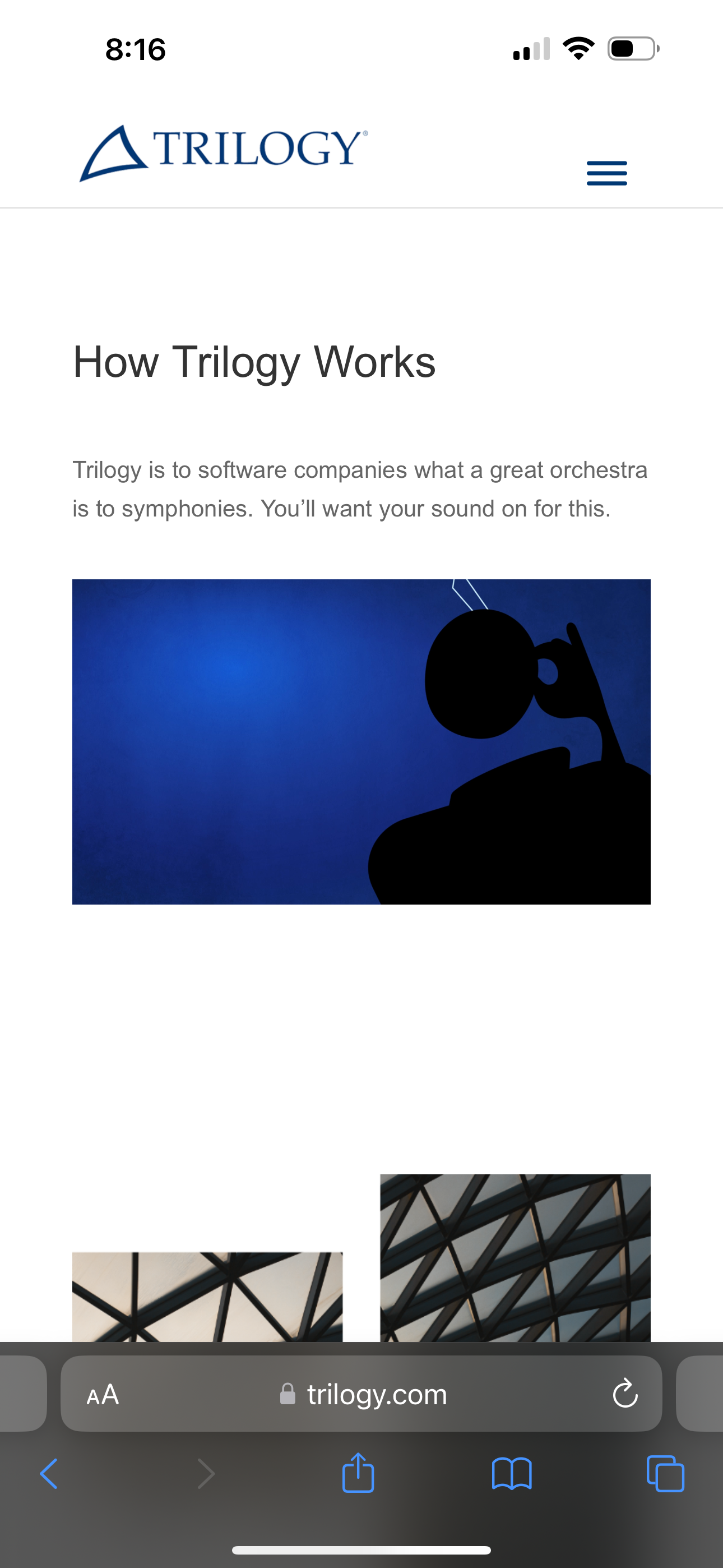
The home page on mobile. Logo has a downward emphasis and dated typgraphy, position of the hamburger menu too low, white space on the home page is huge with gaps for no reason. The video is playing comparing Trilogy to an orchestra along with borderline small paragraph text. I am not going to over criticise this but would you put this mobile view in your design portfolio?

We can see some images below, there is a video playing above, but what are these two images? They are joined but due to the abstract nature and change in the patternig of the skylight roof, that’s not obvious. It’s only later you see this shape repeated. The image breakup makes no sense until further browsing, it’s distrant, abstract and not saying anything.

Moving down the page more massive amounts of white space over and above what they should be on mobile. The icons themselves are unique you think, but they instantly smack of Ai creation - bad spacing and Ai imagery from a company 15 years perfecting what? Are Ai icons more important than the message? Nope.

We have not even dived into the content yet and what it says but again it’s boastful Ai style writing with no substance. You come away form the page knowing not much more than you did before you arrived and now faced with the footer to go somewhere it’s baren. This is feeling hollow, like a shell with no snail. See the hint there?

And onto the menu. Well, I don’t mind that the downward logo device points to the menu, but the spacing is horrid. Honestly is this the design of a company that’s running a company that’s employing candidates for the companies it keeps company with? At this point it was smoke and mirrors, not an ounce of real substance.
This was enough to make me think this is worth doing a critical post on - if nothing else to show some art direction and brand voice.
The first thing I did was go to Google and type in ‘Crossover review’ - “I told Crossover NO and you should too” is the number one story that pops up. A LinkedIn newsletter by Victor Hernandez.
After reading this story I am shocked to say the least. And you don’t need to look far to find disent from people who have worked for them or investigated them. Yep, at the bottom of the post there’s over 100 comments of people who have stories to tell. After reading this story I am shaking my head. What have I gotten into, I go test the system and try and delete my account. Ah - okay you can’t - yep you set up a user account and you can’t delete it. So you’ve applied for a job and sent over your full life story, with contact details work history and all this personal information that they now keep and you can not control. They boast 7 million candidates - well imagine the data-haul on that and what it’s worth?
Story excerpt:
“And here is where things got funny.
Natasha goes on to mention their spyware and she tried to explain to me what is it. I interrupted her and told her this: "I know what that is. Is that the reason why you have that serious tone? Because they are spying on you? Look I took your call just to humor myself. But I don't like being spied on. So if you really want to make me a job offer, then make me an offer. But I'm not going to agree to your spying on me."
At this point Natasha sounded like she didn't know what to do. I may have heard wrong, but I thought she actually stammered because she wasn't expecting my answer. In the end, and while I was telling her to tell her boss, Andy Tryba, not to use the Obama administration as a reference, she finally said "have a good day" and then she hung up. I could be wrong, but I think her voice actually sounded nervous.
Who is Andy Tryba, you say? He's the CEO of Crossover. The Obama thing I said on the phone is because one of the things he mentions prominently on his Linkedin profile is that he worked for the White House on -get this- employment issues!”
I really feel duped now, a bit sick in the stomach from what I am discovering. But hey let’s keep digging and get a good story.
INTERMISSION:
Let’s REWIND: Success in detail

It’s 1992 and I am recreating tartan patterns at Megabyte. Using Aldus Freehand to make the patterns a client was using for a project, taking real world tartan and emulating it. I did the three tartan patterns and finished up the job. A couple of days later, Rory the studio manager who had started, and oversaw the work, called me aside to bring up some issues with my work. He opened the file and showed me the tartan patterns that I had made. “Look here, the lines, they are overlapping, they should not be like that” - he then showed me one he had done.
Confidently I said “No they’re not” - I took control of the machine and zoomed in over 1000% to show how each line was perfectly aligned and the error was not in the base artwork it was in the display at a certain zoom ratio. We went back to Rory’s one and his looked perfect, but when you zoomed up close there were gaps all over the place. 19 year old me had shown Rory the studio manager how to do it properly. Being taught detail and accuracy very early helped me get my first full-time role here. Megabyte became Terabyte in 1992 too, I started January 1993 at 19 years old.
Failure in the detail
I went looking for the Crossover logo, and on downloading that from a logo sourcing company this is what I found. A horrendous mess that was made by someone who has no idea what they are doing. At what point does something like this this get out in the public domain for a company who has 7 million candidates and just as many followers on LInkedIn?
First step searching for the logo was to go to Google and search it up. Various types of logos turned up as it’s a common name, but spotted the one I needed and that was on logowik.com. It looked all good, and downloaded the file. Simply called Crossover.svg. When I opened the file I my jaw dropped, seriously this can’t be real?
Here are the four stages:
First thing to notice on the top right, is we don’t know how the logo got there but there is the option to add a logo yourself. So this could come from anywhere, we’ll say source unknown as there’s no way to tell.
The page itself looks fine, the logo is presented with an advertising interstitial break page. Looks fine here doesn’t it? At this stage nothing is wrong, lets download the logo.
Faced with the formats to download we’re going to pick the usual suspect, SVG. I didn’t bother picking any other formats. But since doing this story I downloaded all formats to check them over.
Downloading the SVG, file all good, file it and open the SVG. Oh my, when I get in there what the hell is going on? I can’t believe that their logo is like this. So lets have a look at the artwork.
Now, on to the jaw dropping mess:
Feel free to click on the images to zoom. First I saw the bump on the right hand side, then the chunk missing on the bottom left. Is this a joke? Honestly, who did this?
Looking at the linework with a preview of the path structure was jaw dropping - not mind blowing just yet, that’s to come, but look at the mess. Mind numbing.
At this stage, I am wondering if this is real. Seriously broken design work here. So, let’s get the real one off the website.
Now, on to the mind blowing mess:
Yes, I can’t believe that mess we just saw, it’s maybe a tracing as that can happen sometimes when apps like Illustrator do their image tracing. How does something like the above happen by human design? Answer? It doesn’t. This means a bit of software has traced, made, emulated a source of some type and output a result.
A tip for image tracing - don’t use it for perfect shapes, it’s good for tracing illustrative things - that’s what I use it for. But if I was tasked with having to re-draw the Crossover logo I would not use it. Re-draw? Yes, in days gone by we’d only get some printed version of the logo and have to redraw a companies logo - mastering bezier curves in Freehand - those were the days.
Downloading the ACTUAL LOGO FROM THEIR OWN WEBSITE
Let’s break this down - on the case:
Okay, opening it up and we can spot similar but not identical issues. From far out they don’t too bad, displays are still pixels so you can maybe forgive… wait a minute.
No that’s not the screen, that’s the linework, just like the example above from Logowik here’s their own logo with not as bad but just as bad design.
The true dirt underneath this comes out when you click the path, it’s once again an human impossible task - nobody would do this on purpose - so it’s copied.
Oh no, it’s repeating, at this stage I wonder whether the tracing is symetrical but no it’s not. In what brand development process is this let through?
Zooming in closer we can see the traced bumpy outline and jagged shapes of the other lower artwork.
Clicking the points again there’s extra points in the middle of straight lines - lazy usually from cut actions.
More multiple anchor points that dont say ‘drawn’ they say ‘made’, so how?
And the final nail in the coffin here, when you make an SVG for the web the canvas needs to match it.
How can an international company do this?
The logo is traced, full of bad linework, extra points and the SVG file is made so the top of the logo will be cut off.
I have no idea how this could ever get through a design process, so I have to guess there was none.
Nobody ever drew this from scratch so where did the logo come from? Is it a previos logo or symbol?
If we rewind to the original Trilogy material, yep, it’s just lazy. I won’t even go into the bad words that are mentioned when it comes to them.
Gutted that the beautiful digital world of networking has this to wade through now, it’s becoming sick like the ocean.
This is leading down another poll result issue on LinkedIn - 80% of responders think good enough is better than perfect.
We’re in deep if that’s true.